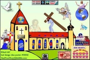
If there’s one thing that drives me crazy in ministry, it’s churches with ugly media design. Let’s face it: many churches are still stuck in 1997 when it comes to the bland, Microsoft-Publisher-clipart-saturated media that they produce as a ministry. But that’s not just bad for public relations, that’s bad stewardship of the resources God has given us as we try to fulfill our commission to tell the world about Him.
I’m no expert in media design, but over the last 5 years I’ve made a concerted effort to try to learn as much as I can about design in an effort to give my church’s media a fresh, modern appeal. And it’s definitely paid dividends for us. Guest after guest has gone out of their way to tell me that they are very impressed with everything from our handouts to our announcement screens. As a guy with almost no money in the church budget for media and very little free time to work on it, that makes me very happy.
Now, if you’re the type that thinks a horrible looking website or a gaudy flyer keeps you from being conformed to the world, this article is not for you.
But if you realize you’ve got some ground to make up in your church’s media and design work, and you don’t have a full-time media specialist on staff, don’t have a lot of money and don’t know where to start, let me encourage you to start with a few simple ideas that made a huge difference for me as a pastor with limited time and resources.
Less is more
One of the biggest tendencies of bad design is to try to cram as much information as possible onto the front page of your website, or use all 35 of your favorite fonts on your next outreach flyer, but take it from me – DON’T! That person receiving your ministry brochure doesn’t need the entire church history or your entire statement of faith or even a flyer that includes every loud color in the rainbow. What they need is something that looks sharp and catches their attention.
Free Logo from CreationSwap.com
So keep your design work simple and keep it clean. Pick one or two clean, simple fonts that complement each other and your design well. Times New Roman is probably not going to add a very dramatic effect to your Easter flyer. And never forget: friends don’t let friends use Comic Sans…EVER.
Make sure your design has plenty of “white space” (Read More). Don’t let it get cluttered or loud. Always try to get down to the bare minimum of text and other elements in your design. The goal is to attract attention, so leave folks wanting more and give them brief instructions on other avenues to get information, like contacting your office or going online.
Invest where you can
You don’t need to have $5,000 a year squirreled away for software and flashy images from iStockPhoto to be effective in your media presentation. You just need to be smart about when and where you do invest in media.
Money for good software, sharp royalty free images or affordable design classes is never a waste. But if you’re like me, you have to invest what you can, where you can. As far as money goes, to me the best investment a ministry can make in their media design is a membership to a service like sharefaith.com. For one yearly fee, you have access to thousands of graphics and backgrounds that can really jumpstart your design work and make life much easier for you.
But even if you don’t have a lot of money, one thing you probably can do is invest by making time. You may not have a lot of money for books and classes on how to use Photoshop, but a quick search on google will yield over a hundred thousand results for “how to use Photoshop.” Google some design tips, watch some online tutorials, with the goal of getting better at design. You may have the latest Adobe Creative Design Suite, but if you don’t know what you’re doing, someone with a free open source copy of GIMP, Microsoft Publisher and a little know-how can produce a better design product than you ever will (I’ll talk more about free programs & services in a follow-up post!). Just give slow and steady effort to learning how to do better media and you’ll be surprised how the design principles you learn will do more for you than a $1,000 suite of design programs ever will.
 If there’s one thing that drives me crazy in ministry, it’s churches with ugly media design. Let’s face it: many churches are still stuck in 1997 when it comes to the bland, Microsoft-Publisher-clipart-saturated media that they produce as a ministry. But that’s not just bad for public relations, that’s bad stewardship of the resources God has given us as we try to fulfill our commission to tell the world about Him.
