Top Mistakes to Avoid Printing Your Restaurant’s Menu

Your restaurant’s menu is often the first impression a customer gets of your business. It should reflect your brand, engage your guests, and highlight your best offerings. But getting it wrong can impact the dining experience and even your sales. Here are the top mistakes to avoid when printing your restaurant’s menu!


Your restaurant menu is more than just a list of items—it’s a key part of your branding and customer experience. A well-designed menu can attract attention, increase sales, and create a memorable dining experience. But when printing your menu, certain mistakes can turn an attractive design into a costly misstep. From poor paper choice to unbalanced text, these mistakes can easily be avoided with a little attention to detail.

Let’s walk through the top mistakes to avoid when printing your restaurant’s menu and how to ensure your menu reflects the quality of your offerings.

1. Choosing the Wrong Paper

Mistake: Selecting the wrong paper for your restaurant’s menu can lead to poor durability, readability, and overall presentation. A flimsy paper can look cheap and tear easily, while paper that’s too thick can be hard to handle or too expensive to use for large runs.

Why It Matters: A well-chosen paper type enhances the tactile experience for your guests. It communicates the quality of your restaurant, making a big impact on the customer’s first impression. You want your menu to be sturdy enough to handle spills, food stains, and frequent use, while still reflecting your restaurant's ambiance and brand.

How to Avoid It: Opt for premium menu paper that combines durability with visual appeal. Our high-quality Parchment Papers offer an elegant and bold option, while textured paper adds a touch of sophistication to your design. For a menu that truly stands out, use vibrant Astrobright Colors, like Stardust White, to capture the energy of your restaurant. Additionally, our Accent Opaques—particularly in shades like White, Warm White, Ivory, and Cream—are a popular choice for creating striking and refined menus.

Slide 1: Accent Opaque White 80lb
Slide 2: Accent Opaque White 65lb
Slide 3: Astroparch Aged Parchment 65lb
Slide 4: Mohawk Via Gray Linen 80 lb

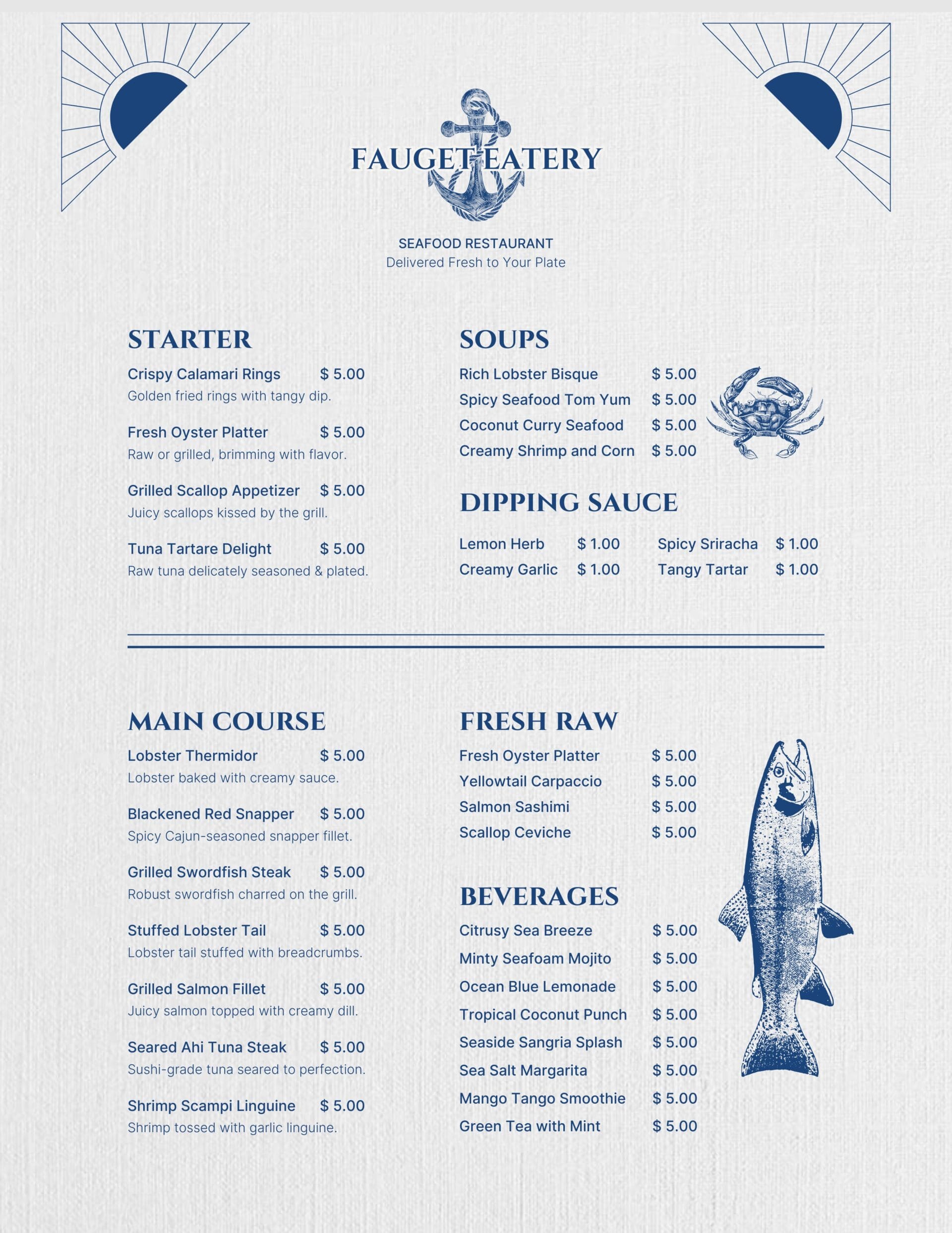
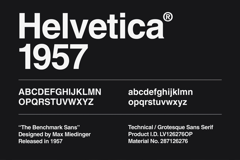
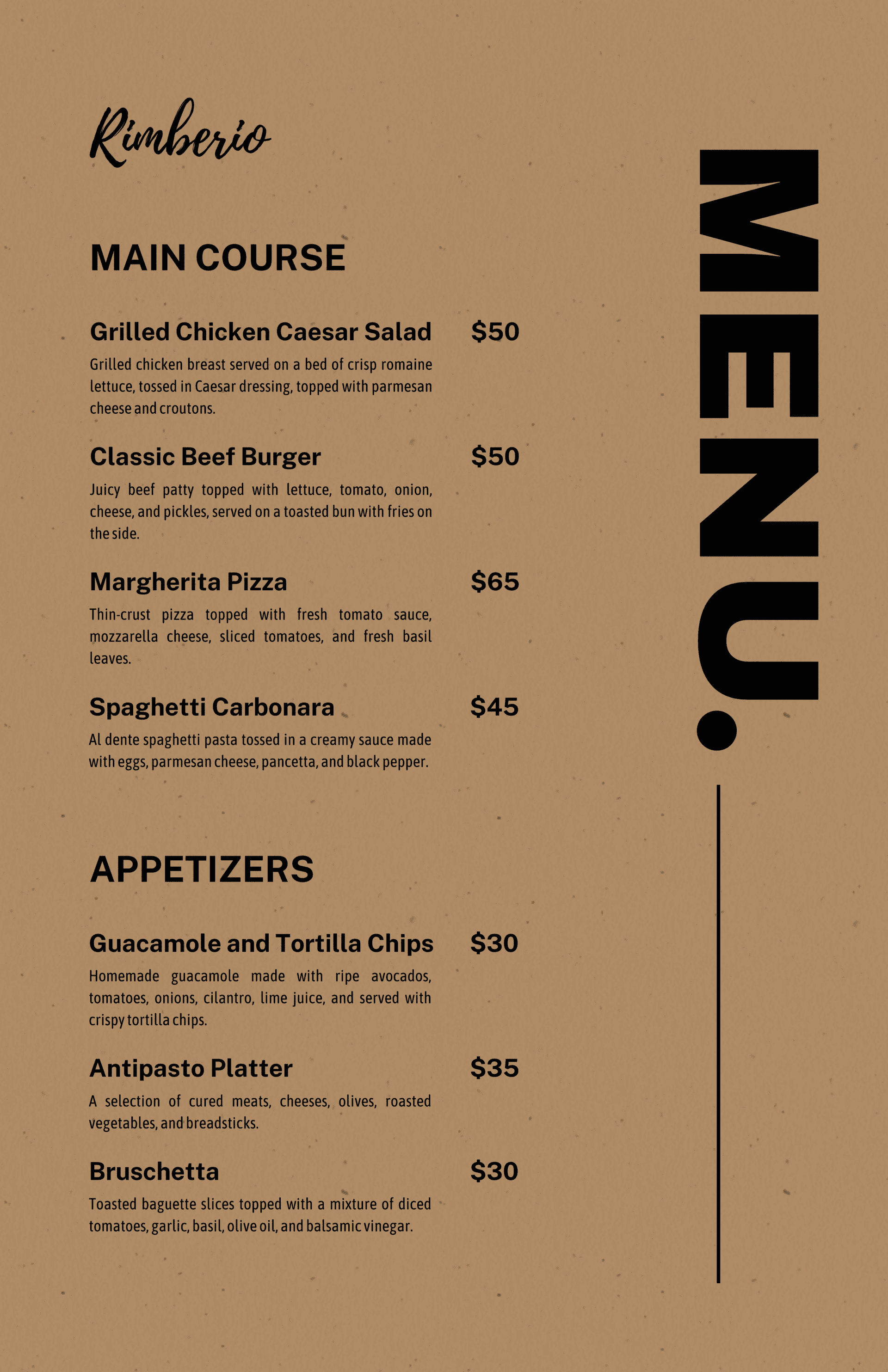
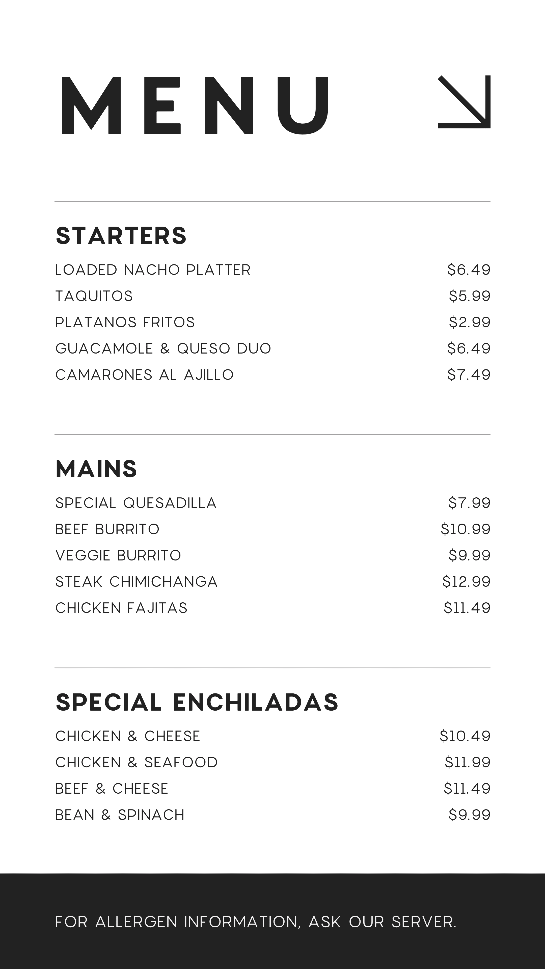
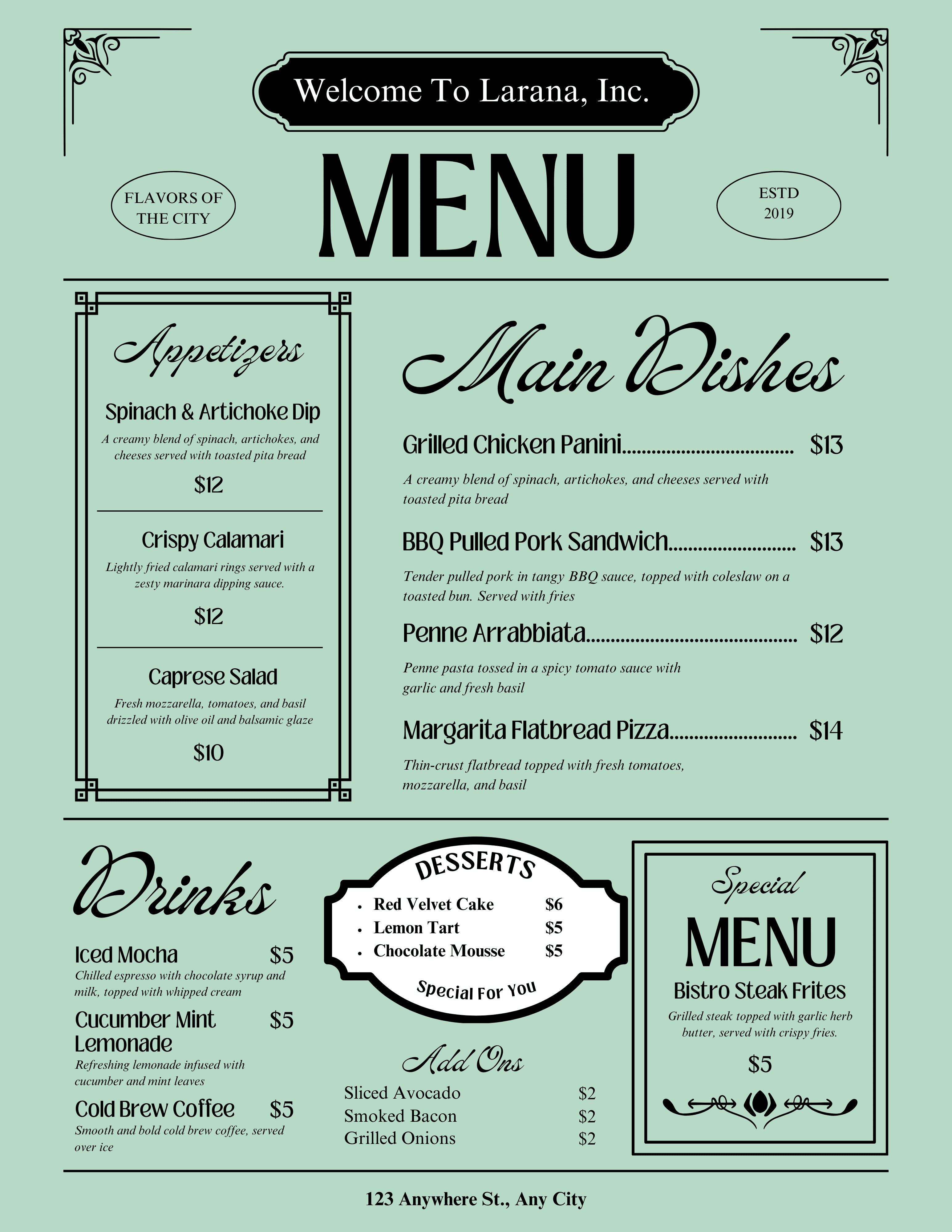
2. Poor Font Choices

Mistake: Using fonts that are difficult to read or clash with the overall design of the menu is a common mistake. Script fonts or overly decorative typefaces may seem attractive, but they can be hard to read in a busy restaurant setting, especially under low lighting.

Why It Matters: Legibility is key when designing your menu. Customers should be able to read the menu easily, even in dimly lit settings, without straining their eyes. Fonts that are too small or hard to decipher can lead to confusion or frustration, potentially impacting the customer’s dining experience.

How to Avoid It: Stick to clear, easy-to-read fonts. Consider using a sans-serif font for the body text, such as Arial or Helvetica, which is clean and easy to read. Use a larger font size for headings and categories to guide customers through the menu. You can incorporate a script font or decorative element for titles or special promotions, but make sure it’s legible and doesn’t overwhelm the rest of the text.

Arial is everywhereThe Story Of The World's Most Famous Font: Helvetica - Design & PaperAdvanced Typography & Publication Design: SR1- Baskerville

3. Overcrowding the Menu

Mistake: Overcrowding your menu with too many items, or cramming too much information into one page, can make it overwhelming and difficult for guests to navigate. When a menu is too busy, customers may struggle to make a decision, leading to frustration or a rushed choice.

Why It Matters: A menu that is cluttered or overcrowded may give the impression that your restaurant lacks focus or direction. It can also detract from the experience by making it harder for customers to find their favorite dishes or specials. An overly complex menu might even confuse your staff when taking orders.

How to Avoid It: Simplify your menu by focusing on your best-selling and most profitable items. A well-organized menu is easier to navigate, and it helps your customers make faster, more confident choices. Group similar items together (e.g., appetizers, main courses, desserts) and consider separating them visually with clear headings. Whitespace is just as important as content—it helps make the menu feel spacious and easy to read.

Slide 1: Royal Sundance Fiber Kraft 80lb
Slide 2: Hammermill Color Copy 80lb
Slide 3: Sterling Premium Digital Gloss 80lb
Slide 4: Accent Opaque Green 65lb

4. Ignoring Menu Size and Layout

Mistake: Choosing an inappropriate menu size can lead to awkward folding, difficulty handling, or cramped text. If the layout doesn’t balance visuals with the menu items effectively, your design can feel chaotic or unprofessional.

Why It Matters: Your menu layout is crucial for guiding your guests’ eyes. A poorly structured menu can make the dining experience frustrating, as guests may struggle to find what they’re looking for. The size should also fit your restaurant’s environment—whether that’s a small, compact menu for casual dining or a larger, more elegant menu for fine dining.

How to Avoid It: Choose the right menu size for your restaurant’s atmosphere and layout. A tri-fold or bi-fold menu works well for casual dining, while a larger Single Sheet menu might be better suited for fine dining or upscale restaurants. Be sure to use a layout that balances text, visuals, and whitespace effectively. Make sure there’s ample room for item descriptions, but don’t let the layout become too cramped. Pay attention to alignment and spacing to keep everything visually organized.

5. Neglecting Print Quality

Mistake: Poor print quality can ruin an otherwise well-designed menu. Low-quality ink or paper can lead to faded text, blurry images, or colors that don’t match the design. This can create a negative impression of your restaurant, making it look unprofessional.

Why It Matters: Print quality affects both the aesthetic appeal and the durability of your menu. If your menus fade or become illegible after just a few uses, your customers may assume your restaurant doesn’t invest in quality. A high-quality print job enhances your restaurant’s image and reinforces the overall experience.

How to Avoid It: Invest in a professional printer or a printing paper distributor who can provide high-quality, consistent prints. Use premium menu paper or coated paper to ensure that your colors pop and text remains sharp. High-quality ink and laser printing tend to provide the sharpest results for restaurant menus, ensuring a polished, professional appearance.

Perfect Your Restaurant’s Menu Design

Your restaurant’s menu is an essential part of the dining experience, and making sure it’s designed and printed correctly can have a significant impact on your sales and customer satisfaction. By avoiding these common mistakes—choosing the right paper, using clear fonts, organizing your items effectively, and ensuring print quality—you’ll create a menu that not only looks great but also helps guide your customers to make confident choices.

At Church Paper, we offer a wide selection of premium menu paper, from textured paper to coated options, designed to make your menus stand out. Whether you’re printing for a casual eatery or a fine dining establishment, we have the perfect paper for your restaurant’s needs.

Make your menu a reflection of your brand and ensure it’s as appetizing as the dishes you serve. Visit us today to explore our collection of high-quality papers!