 In the realm of culinary delights, the presentation of your restaurant menu plays a vital role in enticing customers. One often overlooked aspect of menu design is the choice of fonts. In this blog post, we will explore the best practices for selecting fonts that capture your establishment’s essence, along with the fonts to avoid. We will also delve into the art of font contrast and reveal some of the most popular, overused, and underrated fonts in the culinary world.
The Power of Legibility: Choosing the Right Fonts
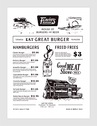
When it comes to menu readability, simplicity and clarity are key. Opt for fonts like Arial, Helvetica, or Proxima Nova that are clean, easy to read, and versatile across various menu styles. Avoid overly decorative or cursive fonts that can hinder legibility, causing confusion and frustration among your diners. Check out our Menu Guide Here
Striking the Right Balance: Contrasting Fonts for Impact
Contrast can add visual interest and hierarchy to your menu. Combine fonts with distinct characteristics to create a balanced composition. Pair a bold and attention-grabbing font for headers with a complementary, more subtle font for descriptions. This contrast will guide the eye and enhance the overall menu experience. Check out our Menu Guide Here
Popular vs. Overused: Recognizing the Difference
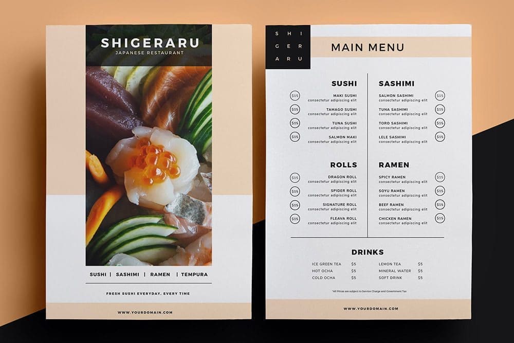 While certain fonts have gained popularity for their versatility and elegance, they have also become overused in the restaurant industry. Fonts like Times New Roman and Comic Sans, once considered classics, are now associated with outdated or unprofessional designs. It’s important to choose fonts that stand out and reflect the uniqueness of your establishment. Check out our Menu Guide Here
The Unsung Heroes: Underrated Fonts for Culinary Creativity
In the vast realm of fonts, some hidden gems are often overlooked but hold great potential for menu design. Fonts like Playfair Display, Montserrat, or Lato offer a touch of sophistication and modernity while maintaining readability. These underrated fonts can add a fresh and unique flair to your menu, setting your restaurant apart from the crowd. Check out our Menu Guide Here
Crafting a captivating menu goes beyond mouthwatering descriptions and enticing food imagery. The careful selection of fonts can elevate the dining experience and reflect your restaurant’s personality. By choosing legible and complementary fonts, striking the right balance of contrast, and exploring underrated options, you can create menus that are visually appealing, engaging, and unforgettable. Remember, your menu is the gateway to your culinary world, and fonts are the brushstrokes that bring it to life. So, unleash your creativity, experiment with font combinations, and design menus that leave a lasting impression on your guests. Bon appétit!