Color matching is an essential element of graphic design and can make a huge difference to the look and feel of your work. To achieve a beautiful color palette, start by choosing a dominant color and then adding in complementary and accent colors. Consider the emotional impact each color might have, and make sure to consider the context your design is being used in.
Experiment with different combinations of colors and the different values of each color. Think about the balance of warm and cool colors, and try to create contrast between your colors. You can also use a color wheel or color scheme generator to explore different color combinations. By carefully selecting each color, you can ensure that your design looks harmonious and visually pleasing.
Check out our selection of *ASTROBRIGHTS*
Additionally, it is important to think about the appropriateness of your color palette. Make sure that your colors are appropriate for the context of the design. For example, if you are designing a logo for a business, select colors that are professional and appropriate. Pay attention to the level of contrast between your colors and make sure that your design is readable and accessible.
By following these tips, you can create a stunning and eye-catching design with beautiful color combinations. Color matching is an important skill for any graphic designer, and by experimenting and exploring, you can achieve amazing results.
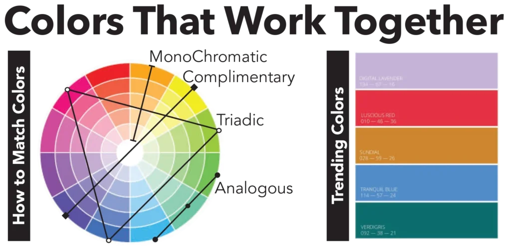
- Monochromatic color schemes are composed of different values and intensities of a single hue.
- Complimentary color schemes are composed of hues that are opposite on the color wheel.
- Triadic color schemes are composed of three hues that are evenly spaced around the color wheel.
- Analogous color schemes are composed of hues that are next to one another on the color wheel.